Why do some edited photos instantly look “fake,” even when the original shot was good?
Most unprofessional images are not ruined by the camera-they are ruined in post-processing. Too much sharpening, unnatural skin smoothing, crushed shadows, and overcooked colors can make a photo feel cheap within seconds.
Good editing should guide the eye, preserve detail, and make the image look intentional. Bad editing calls attention to itself and distracts from the subject.
This guide breaks down the most common photo editing mistakes that make images look amateur, so you can avoid them and create cleaner, more polished results.
Why Overediting Makes Photos Look Amateur: Exposure, Color, and Detail Basics
Overediting is one of the fastest ways to make a photo look cheap, even if it was taken with a good camera or premium smartphone. The most common issue is pushing exposure, contrast, saturation, and sharpening too far until the image loses its natural depth. In professional photo editing, the goal is usually correction first, style second.
A real-world example: a sunset photo edited with heavy HDR, boosted orange saturation, and maximum clarity may look dramatic on a phone screen, but it often falls apart on a laptop, print, or client website. Skin can turn waxy, skies become neon, and shadows show noisy gray patches. This is especially noticeable in wedding photography, real estate photography, and ecommerce product photos, where trust and realism matter.
When editing in Adobe Lightroom, Capture One, or Photoshop, use small adjustments and compare the edited version with the original often. A good practical check is to zoom out and ask whether the photo still looks believable before zooming in for detail work.
- Exposure: Avoid crushing shadows or blowing out highlights unless it supports the mood.
- Color: Keep skin tones, whites, and product colors accurate for a professional look.
- Detail: Use sharpening and noise reduction carefully; too much creates halos and plastic textures.
One useful habit is editing on a calibrated monitor or at least checking images on multiple devices. What looks clean on a bright phone screen may look oversaturated on a desktop display, which can hurt the perceived quality of your photography services, portfolio, or online store.
How to Fix Unnatural Skin Tones, Harsh Contrast, and Oversharpening in Your Editing Workflow
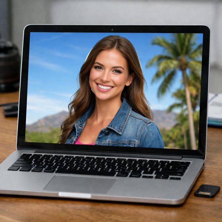
Unnatural skin tones usually come from pushing saturation, vibrance, or white balance too far. In Adobe Lightroom, start by correcting white balance with the eyedropper, then fine-tune orange and red tones in the HSL panel instead of changing global color. For portraits, a slightly warm skin tone often looks more natural than a perfectly neutral one, especially in wedding photography or personal branding shoots.
Harsh contrast is another common reason images look cheap or over-edited. Instead of dragging the Contrast slider aggressively, use the tone curve gently and protect highlights on skin, white clothing, and skies. A real-world example: when editing outdoor portraits at noon, lowering highlights and lifting shadows usually looks more professional than adding more contrast to an already bright scene.
- Use a calibrated monitor or a reliable laptop display before making final color decisions.
- Edit RAW files when possible for better control over exposure, color grading, and skin correction.
- Check the photo at 100% zoom before applying sharpening or noise reduction.
Oversharpening often creates crunchy hair, rough skin texture, and bright halos around edges. In Lightroom or Adobe Photoshop, apply sharpening selectively with masking so it affects eyes, lashes, fabric, or product details-not smooth skin or blurred backgrounds. If you offer professional photo editing services, this small step can make your work look more polished and reduce the need for heavy retouching later.
Professional Photo Editing Quality Control: Spotting Artifacts, Halos, and Export Issues Before Publishing
Before you deliver or upload an edited image, zoom in to 100% and inspect the areas where mistakes usually hide: hairlines, building edges, jewelry, product outlines, and high-contrast skies. In professional photo retouching, the most common quality control failures are sharpening halos, patchy skin texture, banding in gradients, and compression artifacts caused by aggressive export settings.
A simple real-world example: an e-commerce product photo may look clean on a laptop, but once uploaded to Shopify or Amazon, over-sharpened edges around a white sneaker can create a gray outline that makes the product look poorly cut out. That small defect can weaken trust, especially for premium products where image quality directly affects perceived value.
- Check at 100% and 200% zoom for halos, jagged edges, dust spots, and clone stamp repetition.
- Preview the image on a calibrated monitor, phone screen, and dark background before final approval.
- Export separate files for web, print, and social media instead of using one universal JPEG.
Tools like Adobe Lightroom and Photoshop make this easier with soft proofing, color profile checks, and controlled sharpening during export. For web publishing, use sRGB, avoid excessive JPEG compression, and compare the final exported file against the edited master-not just the preview inside your editing software.
If the image is for paid ads, real estate photography, product listings, or a client portfolio, quality control is not optional. One extra minute of inspection can prevent expensive revisions, rejected marketplace uploads, and images that look amateur after publishing.
The Bottom Line on Common Photo Editing Mistakes That Make Images Look Unprofessional
Professional editing is less about dramatic changes and more about control. Before exporting any image, ask whether each adjustment improves clarity, supports the subject, and feels believable. If an edit draws more attention than the photo itself, it probably needs to be reduced or removed.
Use a consistent workflow, check your image on multiple screens, and compare it with the original before final delivery. When in doubt, choose restraint over intensity. Clean, intentional edits build trust, protect image quality, and help your photos look polished without appearing artificial.